A Brief Overview of Color Magick

We’ve all heard the popular wisdom that specific colors mean certain things. This is especially true if you’ve dabbled in “candle magick” or read any book on Wicca and Practical Color Magick. For example, (source: elementsofmagick.com) green is for prosperity, fertility, employment, good luck, and beauty, and red is for lust, passion, courage, willpower, vigor, endurance, and ambition.
These color attributions appeal to us from a common sense point of view.
However, color, as researched from a psychological slant, provides a different (but not contradictory) perspective:
In purchasing and branding, consumers base their judgment more on whether a color matches the product being marketed rather than just the color itself. The intent to purchase an item is affected since consumers judge the persona of the brand based on the colors they use – this is also balanced by the fact that people are drawn to brands that stand out. Source: Psychology Today
Basically, context is everything, and when it comes to the corporate world, companies create the context by which we judge color.
Now, keep in mind the Isolation Effect described above: an item that stands out is more likely to be remembered. In order to make a color “pop,” you place it next to its complementary, or opposite, color.
This feeds directly into using colors in magick.
The Formula
The formula is as follows: create a context (intent, persona, magical hierarchy, etc.) that you can attribute directly to your color.
Then, combine or contrast it with its opposite so that your context is “forgotten” – the same way we’re usually unaware of the effect of color on the consumer choices we make.
Opposites, Negatives and Afterimages
The type of “opposite” depends on which color model to use. Unless you are a color printer or television screen, you will most likely need to use colors that absorb light and colors that mask light (as opposed to colors created by light). An example in real life is the blue-green shadow of a red apple.
Colors That Absorb Light
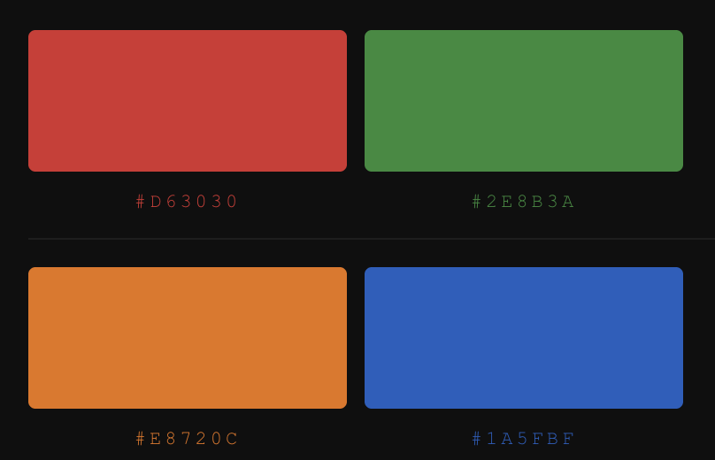
red-green
orange-blue
yellow-purple
Colors That Mask Light
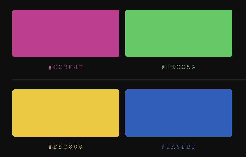
magenta-green
yellow-blue
cyan-red
Chaos Magicians and Their Use of Neon Colors For Sigils
By using the after-image or “negative” color in their sigils, chaotes invoke the raw essences of the “positive” colors that ceremonial magicians frequently work with. Consider that the color we “see” is everything the thing itself is not (e.g., A red apple absorbs all colors but red since the red is reflected in our sight). By using cyan for a “red intent,” not only is your physical sense of sight fatigued, but your conscious connection to the sigil is subverted.
The overall or meta-effect of colors on consciousness supports the usage of colors in the Western Hermetic Tradition and can even be a metaphor for Eastern branches of philosophy.
Advaita Vedantic Nondualism Theory of Existence
First off, if you are unfamiliar with Advaita Vedanta, the gist of it is this: There exists One Truth/Reality, i.e., The Unchanging or Nothingness, from many different perspectives, including that of dualism.
Second, the Unchanging is not in the world – the world is in “it.” Only by perceiving oneself/the world can there be a reference point for the idea of the formless unchanging.
Here’s where the theory of color fits in essentially existence as we are able to know it is but an after-image of Nothingness.
Article by Helen Kirkby
Helen Kirkby, otherwise known as Soror Nihil Obstat, is a part-time artist and full-time occultist currently living in Los Angeles. She has an upcoming book on the Thelemic Qabalah from Nephilim Press. Her personal blog is https://alephnull429.wordpress.com and you can reach her @Kirkby_Helen or facebook.com/nihil0bstat.